Types of Variable / Statistic / Visualizing Data
Table of contents
Variable
- A variable is a characteristic of an object or an event.
- Set of values obtained by a common measurement of the characteristic.
Univariate or multivariate
The number of variables is sometimes called the dimension of the data.
- Quantitative or qualitative
Quantitative Variable
Variable that can be measured numerically.
Discrete Variable
- Can only take on a finite number of values.
Continuous Variable
- Can take on an infinite number of values.
Qualitative Variable (Categorical Variable)
Variable that cannot be measured numerically.
Also called a categorical variable.
Examples of qualitative variable include: yes/no, gender, country, etc.
Statistic
A statistic is a number obtained via some calculations on the data.
Such calculations are called descriptive statistics or summary statistics.
If histogram is a visualization of the distribution of data, then statistic is a numerical characterization of the data.
Obviously enough, descriptive statistics is mostly performed on quantitative variables.
Some common descriptive statistics include:
- Representative Value: shows the tendency of the data in a distribution
- Mean
- Median
- Mode
- Dispersion: shows the spread of the data in a distribution
- Variance
- Standard Deviation
Representative Value
In a perfectly normal distribution, the mean, median, and mode are all the same.
However, if the distribution is skewed, these representative values will be different.
We can use these values to understand the tendency of the data, hence the name “representative value”.
The representative value is not always the best way to understand the data.
For example, if the data is skewed, the mean will be greatly affected by the outliers.
Therefore it is important to understand the distribution of the data with the help of i.e. histogram, before using the representative value to understand the data.
Mean
The mean is the average of the data.
We often use the bar above a variable $\overline{X}$ to denote the mean of a sample, and $\mu$ to denote the mean of a population.
Median
The median is the middle value of the data.
When the sample size is even, the median is the average of the two middle values.
Due to its nature, unlike the mean, the median is not greatly affected by outliers.
Mode
The mode is the most frequent value of the data.
This statistic is not used as often as the mean or the median.
When the sample is from a continuous variable, we must first group the data into bins just like in a histogram.
Dispersion
Variance
The variance is the average of the squared difference between each value and the mean.
- Variance $\geq 0$
- Variance $= 0$ if and only if all values are the same
- Higher the dispersion, higher the variance
Standard Deviation
The standard deviation is the square root of the variance.
Population standard deviation is denoted by $\sigma$.
Visualizing Distribution of Data
The distribution of data is the pattern of the data.
By looking at the distribution, we can understand its tendency and dispersion.
Histogram
Histogram is one common way to visualize the distribution of data.
The purpose of a histogram is to understand the general overview of the data, not to confirm any specific observation.
For Discrete Data
For discrete data, the histogram is a bar graph with the value on the x-axis and the frequency on the y-axis.
For Continuous Data
For continuous data, the histogram is a bar graph with the range of values (“bin width”) on the x-axis and the frequency on the y-axis.
It is important to choose the bin width wisely, because it can greatly affect the shape of the histogram and hence the interpretation of the data.
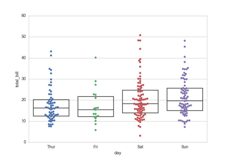
Box and Whisker Plot
Box and whisker plot is another common way to visualize the distribution of data.
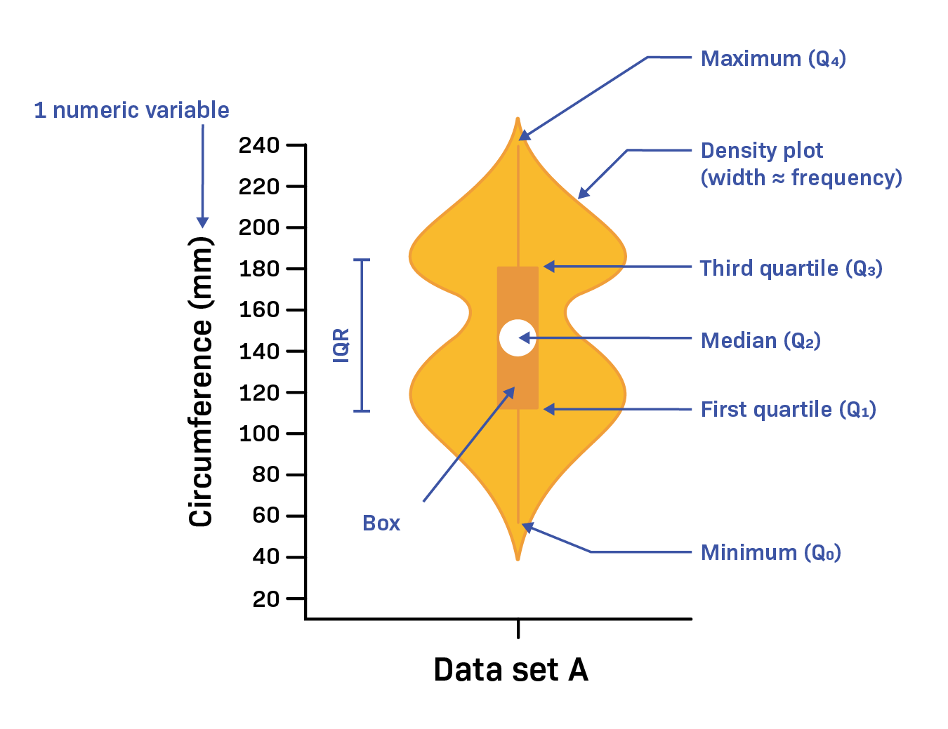
Quartile
A quartile is a value that divides the data into four equal parts.
To find the quartiles, we first need to sort the data in ascending order.
Then, we can find the quartiles as follows:
- The first quartile $Q_1$ divides the data into the bottom 25%.
- The second quartile $Q_2$ divides the data into the bottom 50%.
- This is the same as the median.
- The third quartile $Q_3$ divides the data into the bottom 75%.

Box
The box in the box and whisker plot is a rectangle that shows the quartiles.
The length of the box is the interquartile range (IQR), which is the difference between the third and first quartiles:
$$ IQR = Q_3 - Q_1 $$
The median is shown as a line inside the box.
Whiskers
The whiskers in the box and whisker plot are the lines that extend from the box.
The ends of the whiskers end at an observed data point.
There are many different ways to define the whiskers.
One way to draw the whiskers is to extend them to the minimum and maximum values.
Another way is to extend them to the values that are within $1.5 \times IQR$ from the box (see the image above), and all other values are considered outliers.
Whiskers are not always drawn in the same way. They may be even or uneven depending on the definition and data.
Outliers
An outlier is a data point that is far away from the rest of the data.
There really is no single definition of what an outlier exactly is.
It could be points that are outside the whiskers, or data points that are more than 2 or 3 standard deviations away from the mean.
Error Bar
Error bar is a line that shows some range of values.
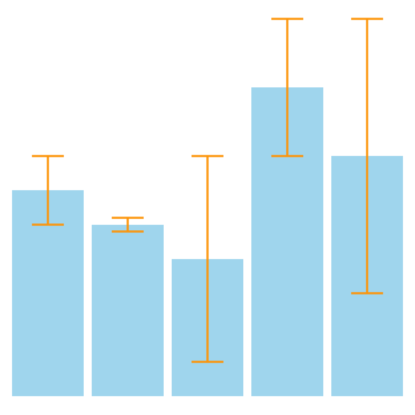
Depending on the context, the range may be the standard deviation, the standard error, or the confidence interval.
Because it can mean different things, it is important to describe via a legend what the error bar represents.
In descriptive statistics, the error bar is often used to show the standard deviation. In this case, the longer the error bar, the higher the dispersion.
In inferential statistics, the error bar is often used to show the standard error or the confidence interval. In this case, the error bars shows you a sense of “significant difference” between two groups.
Violin Plot
Violin plot is a combination of a box and whisker plot and a plot of a probability density function.
Read more about violin plots here.
Swarm Plot
Each data point is plotted along an axis in a swarm plot.
Can be used with other plots such as box and whisker plot.